
This week, John Steiner challenges us to explore some tools of photo composition. I’m going to concentrate on lines and patterns. When I started, I wasn’t sure if I could come up with enough images. But I was amazed at how many images in my collection show off lines and patterns, usually as essential compositional devices.
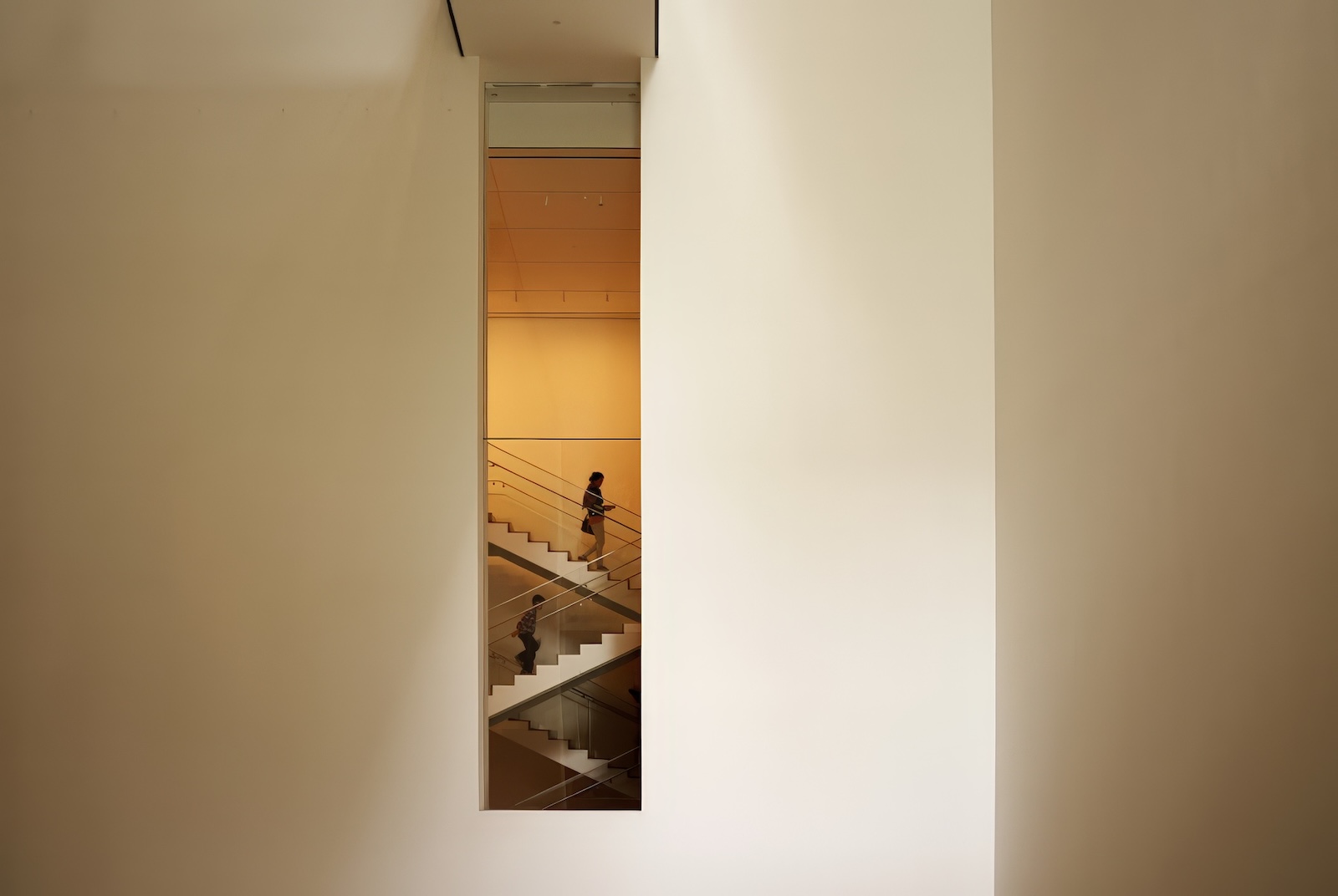
In the featured image above, vertical lines divide the frame into sections. They also frame the rectangular region containing the steps. The stairs, however, present diagonal lines against the overall vertical line theme, thus calling emphatic attention to the main part of the image. This is an archetypal use of lines and patterns. (Shot in New York’s Museum of Modern art.)
Lines and patterns are significant in the following images. In the image on the left (the Getty Museum courtyard), angular lines are created converging throughout the image. The edges and corners of the buildings, the pattern of the blocks of which the walls are constructed, and converging stairways and their railings all draw the viewer’s focus to the sculpture in the middle. The fact that the stair railings cut across the vertical lines at an angle not only adds to the image’s interest but aids in framing the sculpture.
In the image on the right, horizontal and vertical (yes, they are, even though the image is created on a slant) lines of the enclosure frame the entrance to the building. The railings at an angle further draw the eye to the entrance.


Here is an image from Grace Farms in New Canaan, CT. The interplay of the parallel lines and the broken railings serves to create interest and frame the main image. The parallel steps of the stairway, with the curving of the stairway, draw our vision up and around. The impressions shaped by the lines and curves in this image are so strong that we can easily picture the stairs continuing around the bend at the top.

Below, on the left, the fences both frame the image and draw the eye to an invisible vanishing point. The effect adds strength to the picture and creates a focus for the eyes in the enclosed lawn.
On the right, the vertical trees unmistakably frame the central element of the image, while the lane at the bottom draws the viewer’s focus to the chair in the clearing.


Something different… The curved sections, strongly delineated by the dark curves (lines) in this image reinforce the structure of the building in a way that underscores Frank Lloyd Wright’s imaginative design for New York’s Guggenheim Museum.
(Compositionally, curves can be lines.)


In this interior from the International Yacht School in Newport, there are lines and patterns all over the place, all of them critical to creating an interesting picture. They include: the vertical brick columns, the balcony with the horizontal lines of the railing, and, most of all, the staircase with steps parallel to the balcony and railings that go up at an angle. They all contribute to a strong picture and lead the focus onto the hanging boat (itself a horizontal line.

Below, in the image at left, the fences draw the eyes up and in, almost pointing at the house. This image was in an earlier One Four Challenge. (This image was constructed with substantial AI, although the fences are real. I actually created numerous variations of this, all with the fences intact, underscoring their importance to the composition.)
On the right, the strong geometry was a feature of the building’s design. But it also contributes to the strength of the image, especially the railing to the left, which leads the viewer’s eyes across the image to the glass wall of the building.


In this image from the Los Angeles Getty Center, the lines of the railings along with the patterns on the blocks all orient the viewer to focus on the Los Angeles vista spread out ahead. The fence at the edge of the balcony helps to create a “here-there” feeling with delineates between the building on one side and the vista on the other.
Compositionally, the image below of Normando’s Cantina (in Abiqui, New Mexico) is a very interesting and appealing photograph. It’s far better than a direct view of Normando’s, minus the tree. The tree provides essential balance to the image. The roofline leads directly to the sign, apparently the main focus of the image. This perspective is aided by the lines of the awnings. The image is punctuated by the sign post, which also supports the focal sign (compositionally as well as in fact!).


Finally, this image, also from a recent One Four Challenge, from the Hammond Gardens in New York, illustrates the strong effect of lines and curves (even virtual ones). The vertical trees, arranged close together and along a gentle curve, create an inside, to the left, and an outside, to the right. The vertical bamboo stalks create a border to the left. Together they define the path in between. The patterns of sunlight and shadows on the path itself, keep the eye moving in a gentle curve. The overall effect is of order in the natural scene, while the gentle curve adds a feeling of serenity.

That concludes my offering for this week’s Lens Artists Challenge. Many thanks to John Steiner for a most enjoyable challenge. I hope you enjoyed my pictures and commentary. If you’re not already participating in the Lens Artists Challenges, I encourage you to consider joining in. If you’re not sure what this is all about, go here for an introduction.

Leave a ReplyCancel reply